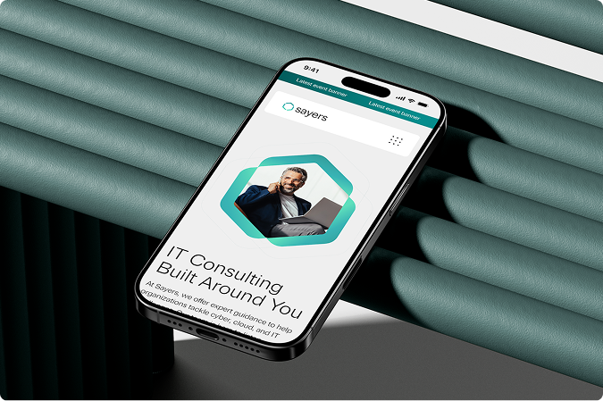
The Big Picture
Sayers had outgrown its brand. A cybersecurity and IT consultancy with real personality, the identity just needed to catch up.
Context
The Situation
Sayers had just gone through a rebrand. The new identity had personality, structure, warmth, a point of view. The website had none of it. The goal was to close that gap.
The site needed to feel like the brand: precise, technical, and still human.
Design Direction
Working alongside an art director and another designer, we built a visual language around exposed grids, gradients, and bold typography. I contributed to the rebrand and then carried those decisions into the web experience, making sure they held up in motion, layout, and interaction. The system had to feel cohesive across 20+ pages without getting rigid.