The Big Picture
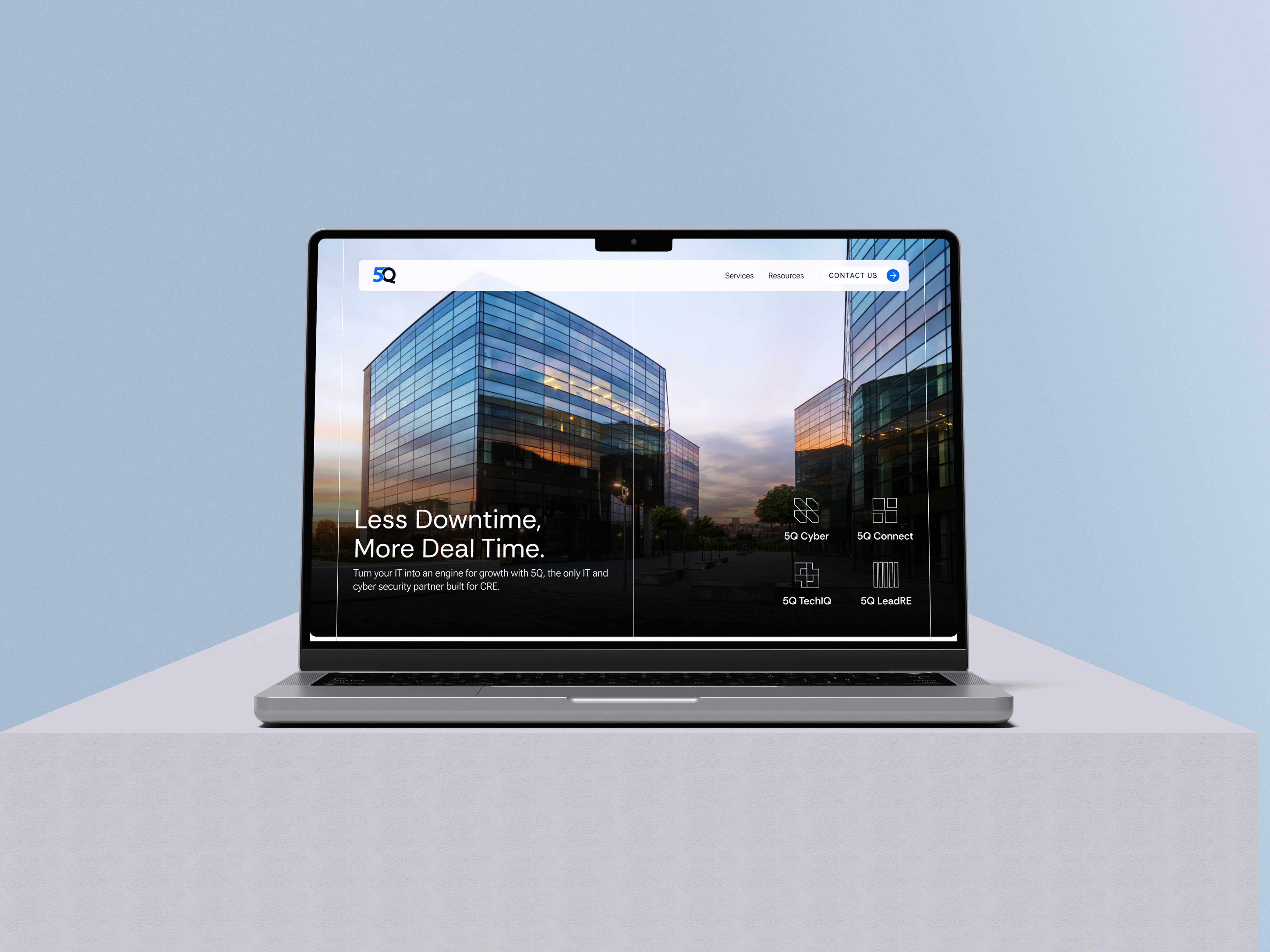
5Q has been protecting commercial real estate technology across the full property lifecycle for years. The brand just did not show it.
Context
The Opportunity
Cybersecurity branding defaults to the same handful of visuals. Shields, locks, dark backgrounds, an aesthetic that signals danger rather than confidence. 5Q already had the authority and depth. The refresh was about making that legible at a glance.
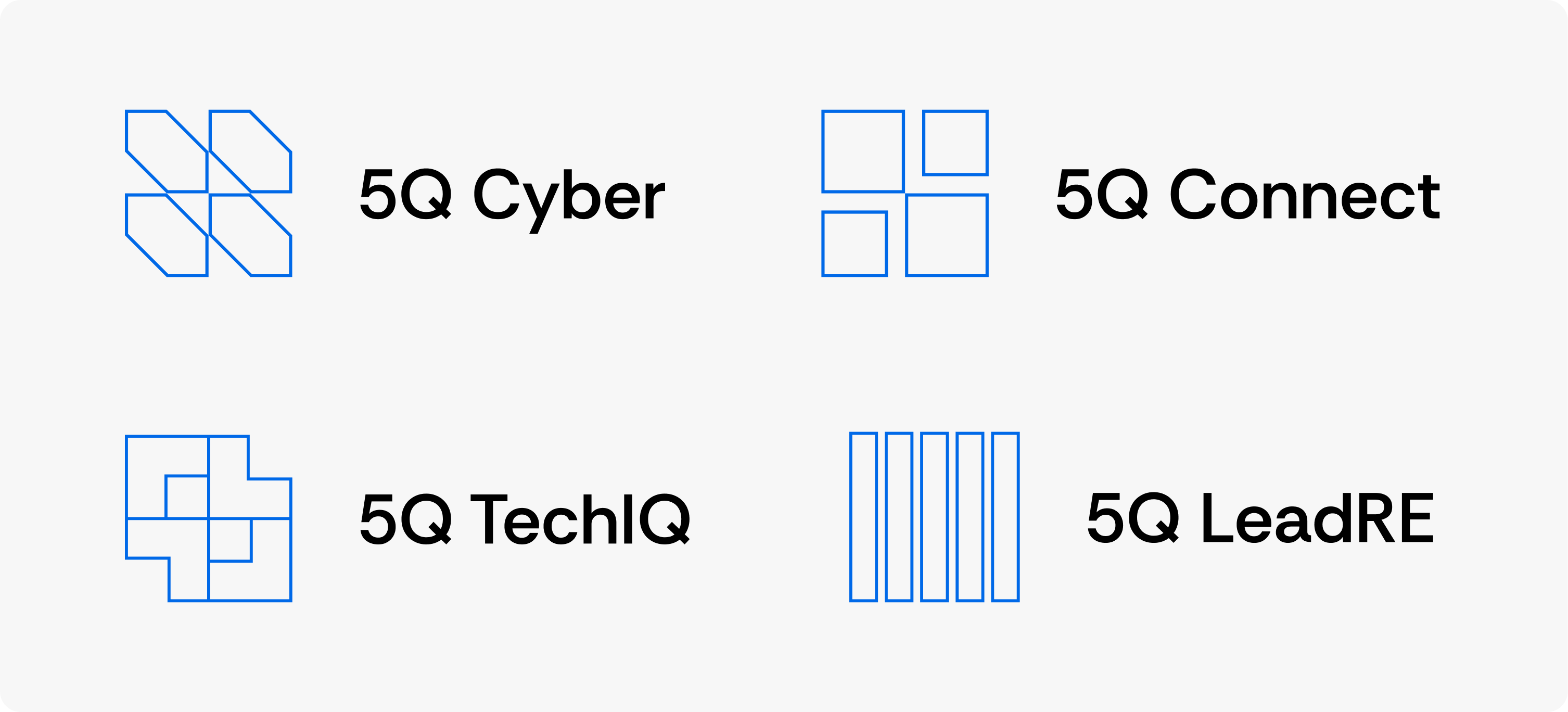
The Visual System
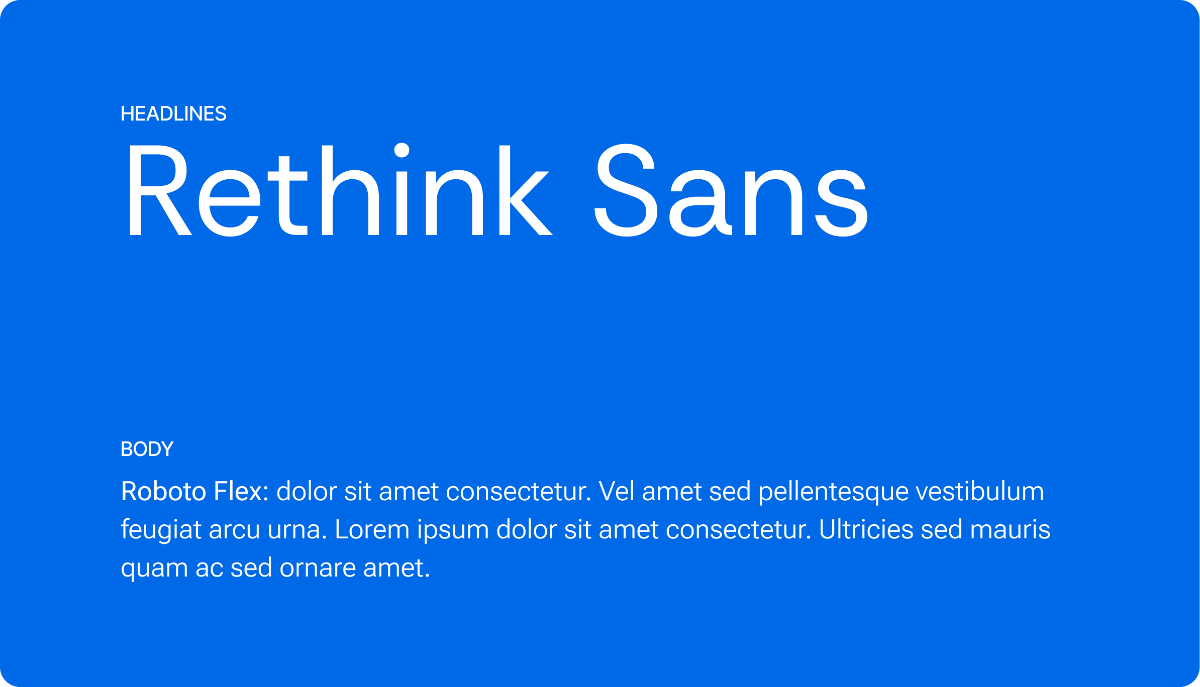
The exposed grid references architectural blueprints, a visual language CRE professionals already understand. Colours were warmed from the existing palette to bring vitality without losing authority. Rethink Sans leads headings with geometric confidence; Roboto Flex keeps body copy readable and grounded. Present without being stiff.