
American Typewriter: The Balancing Act of Robustness and Ornamentalism
- Mar 16, 2021
- 2 min read
Updated: Apr 18, 2022
Brief: Create 3 promotional items of a given typeface. The promotional items are a type specimen booklet, a poster, and a motion piece. The type specimen booklet had to be 5x8 inches and a minimum of 16 pages. The poster had to be 11x17 inches (Tabloid). The motion piece had to be at least 30 seconds long.
Concept: My given typeface, American Typewriter, was released in 1974. The aesthetics are inspired by 70s music.
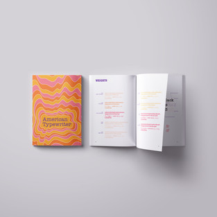
The point of a type specimen is to show off the typeface. To see the letterforms and take a detailed look at the anatomy. The way the letters’ shape changes when it is Roman (regular) or Oblique (italic). The first step was research, and you can find it here on Medium. Next came the pagination and the sketches as seen below.

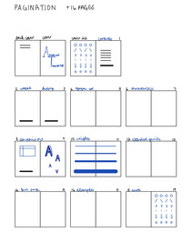


The pagination helps with deciding how many pages a topic would get. American Typewriter doesn’t have a bulky history so filling it up did get challenging. Topics in the book included history, anatomy, and usage.
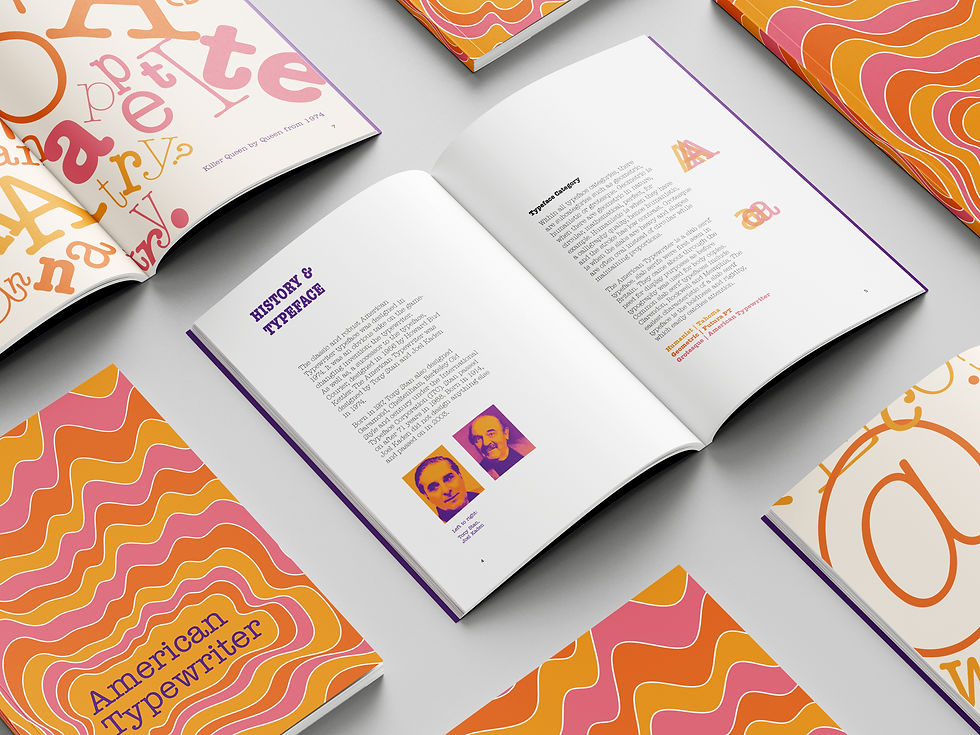
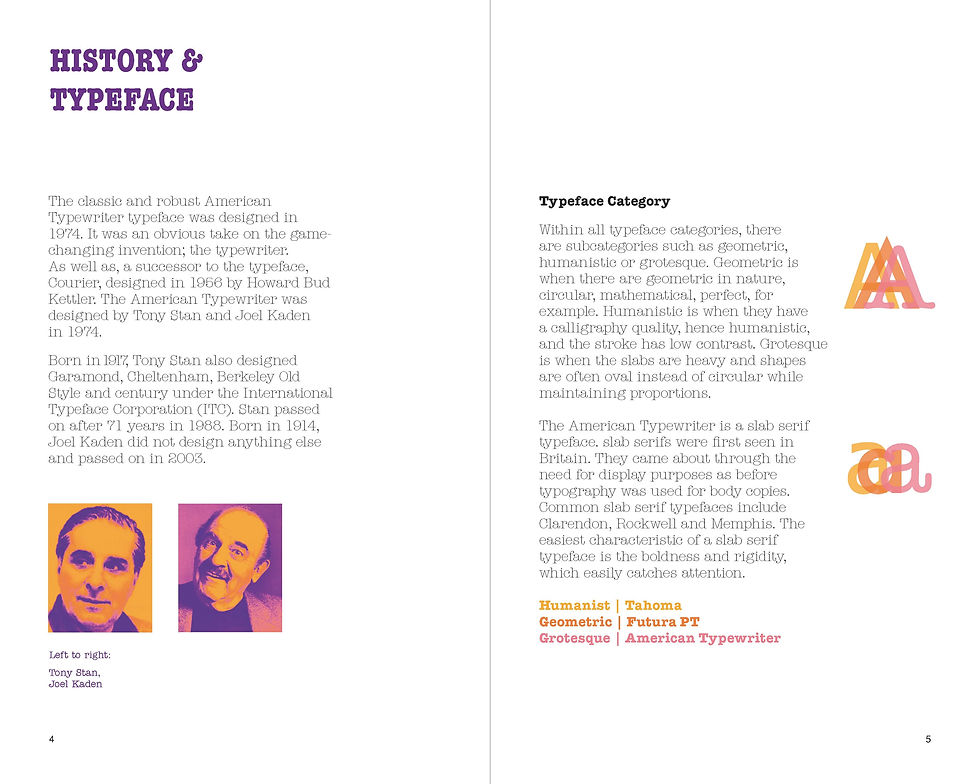
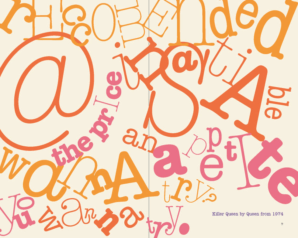
The type specimen booklet’s star pages are the History spread and the Queen spread. As seen below:

The poster was the most difficult part. Finding a composition that played well with curvilinear aspects but still maintaining geometric integrity proved to be a challenge. A challenge that had more than 20 drafts. A challenge that would have been avoided if I spent more time on tighter sketches.
The motion piece was the first time I had to work with Adobe After Effects. I had quite a time learning while doing it. I wanted a simple piece that had the typewriter effect. After effects already had this effect as a template, which saved a lot of time.
The motion piece features the Queen song that is in the type specimen booklet, using it as a springboard for the typeface. Killer Queen by Queen was released in 1974, hence the choice for the piece.
All in all, I am pleased with all 3 pieces. In the beginning, when the typefaces were being assigned, I was disappointed by American Typeface. I never particularly took a fancy to it. It was like walking past a shop you never knew had a product you would actually love. It’s a delicate balance between robustness and ornamentalism. My favourite part of the booklet is the colour palette. My favourite part of the poster is the overlapping contour lines. My favourite part of the motion piece is the fade into Killer Queen.


Comments